It’s been a long time coming. I have finally committed myself to learn the craft of digital illustration.

Hooked and dragged down the rabbit hole
For a long time, I held in awe Yuko Shimizu‘s bold, and utterly singular illustrations. Her work, which spans editorial illustrations, book cover design, advertisements, album cover art and more, is a unique blend of traditional Japanese Ink and digital coloring with Photoshop. It was down the rabbit hole from there. I quickly discovered Victo Ngai whose work is at the crossroads of traditional and digital art. More than her technical expertise with the line, or creative expanse of her ideas, it’s her sense of color that truly speaks to me. Her palette and the ability to apply it to the theme or project at hand is what makes her a master. And then there is Matt Griffin, who’s ability to evoke a sense of space and gravitas is something that I have seen nowhere else.
In 2017, I finally gave into the temptation of digital illustration. For anyone looking to start, there is a host of software to accelerate the learning. Inkscape was the logical first step to help me get started because it has extensive functionality and more importantly, it’s free. Although I’ve moved away from Inkscape as the platform of choice, I still have it installed in my Mac purely for it’s bitmap trace functionality. Free and open source as it may be, the interface is clunky.

Then I discovered, Affinity designer – a Photoshop challenger, which promised no bloat, an active community for learning, affordability, and a perpetual license ( an Adobe creative cloud suite was and still is an expensive proposition given the stage of my current capabilities). The professional-league capabilities gave me the confidence to pick-up minor projects like designing posters and t-shirt designs for the running club I’m part of, and eventually blossomed into product packaging for a friend’s start-up.
While those projects have given me valuable experience, digital illustration was something that I still held at arm’s length. My work was functional at best and served the marketing or commercial needs of my friends.
This connection with a real-world problem is another aspect about digital illustration that I really love. Here, the art has a real-world purpose, which is beyond aesthetic, and by virtue of which it doesn’t bother the artist or the client or the viewer with unnecessary verbiage. The art is the means to an end – and the end is typically to inform, evoke interest and to elicit action. More on this in an other post.
My first respectable experiment
There was no need for more inspiration. I was curious to learn how Victo or Yuko scan their work and then extract the various “layers”. Eventually i discovered their method, and I found myself leaning more towards the vector format rather than raster. I wanted the portability, scalability and a sense of timelessness that vector illustration bestows on a work.
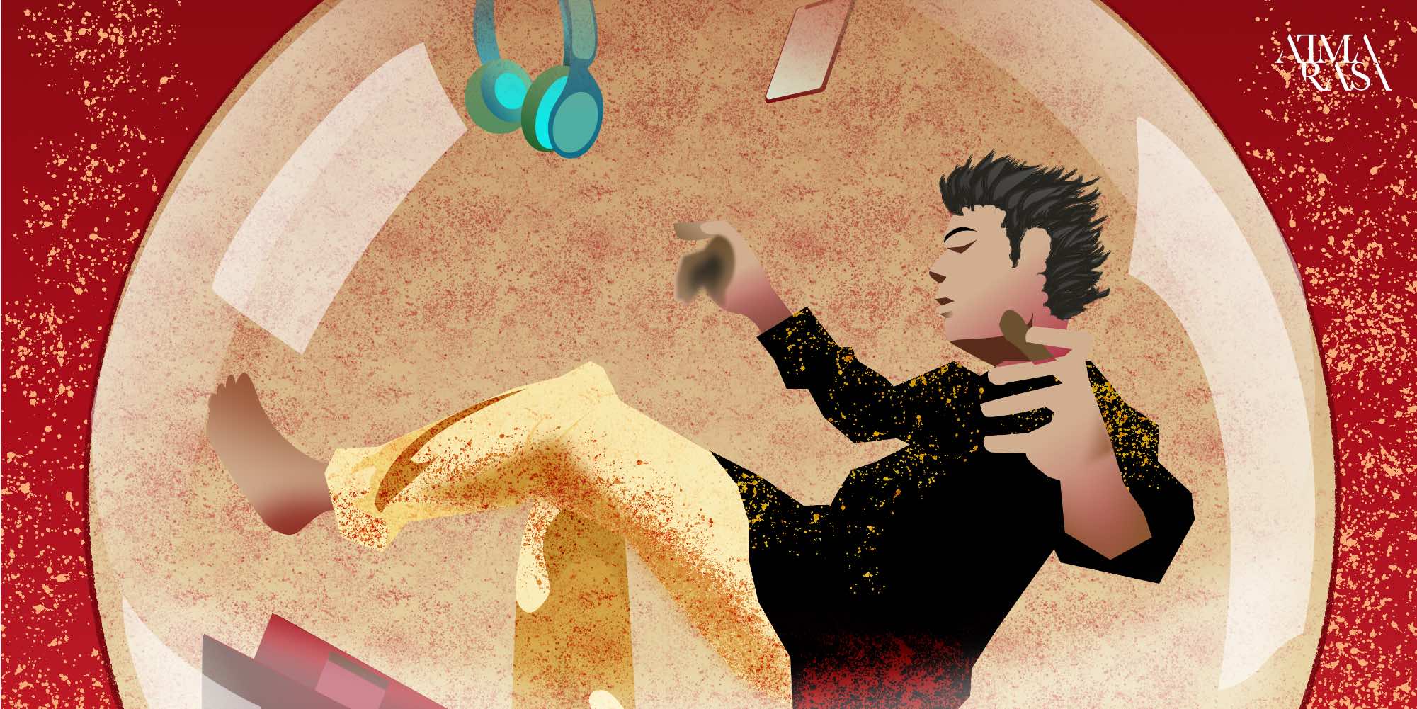
This week saw me finishing a full fledged digital painting. While searching for a suitable theme, my current Work-from-home situation, enforced by COVID-19, came easily to mind. WFH started to feel like a self-contained bubble.
With an idea in hand, I jumped right in – scanning a hand-drawn sketch, developed the drawing using Bezier curves, and absolutely enjoyed playing with palettes, textures, blend modes, and brushes.

So digital is better than traditional media?
There is no scope for comparison. For industry work, traditional media will kind less takers. I believe digital requires a strong footing in the traditional tools and concepts (Victo’s work is proof of this). I see digital as an additional tool in my repertoire. it may come to influence my work across other media too. Some ways it is different, and perhaps better:
- Vector or Raster – Rasters give beautiful textures, but they are pixel based. I would rather work in vector and retain the ability to scale my artwork. Scalability is the key USP.
- Working with Z-layers – It’s akin to creating collages. It lets you sweep inconvenient details under the layers, that are stacked on top. Masking and clipping take add infinite possibilities to the kind of textures and effects one can create. I use liquid masks when working with watercolours, and in terms of what one can do, the options are truly infinite in digital.
- Ctrl/Command+z – with undo, mistakes simply do not exist in the digital art world. Only happy accidents, as bob ross puts it.
Learning the craft
The learning curve is quite steep and not really straightforward. There will be tricky spots where one could achieve a result simply with a click of a few buttons, yet for a lack of awareness, my current workflow may be circuitous. There are many considerations while creating digital illustrations ( document type, color space, output format, sizes and more), and the importance that I associate with each of these may change as I learn. I see long hours of reading, observing, watching videos and learning ahead of me.
While the lacklustre personal results teamed with incredible talent out there gives the impression of not moving ahead at all, i’m trying to find joy in every work that i’m investing time into.
The journey is the payoff, I try to tell myself


